Trading Charts: Read Signals & Build Automated Rules
A trading chart is a visual record of an asset's price over time — price on the y-axis, time on the x-axis — and it is the primary tool every trader uses to identify opportunities, whether they act manually or through an automated bot. Before you can build a strategy that executes itself, you need to read charts well enough to describe what you see in precise, logical terms. This guide covers chart types, price action, indicators, patterns, and timeframes — then goes one step further and shows you how to translate each of those signals into concrete automated strategy rules using a no-code visual builder.
What Is a Trading Chart?
A trading chart plots the historical price of an asset across a chosen time period. Every point or bar on the chart represents price action — the raw movement of price driven by buying and selling pressure — and together those data points reveal trends, reversals, and consolidation zones that traders act on.
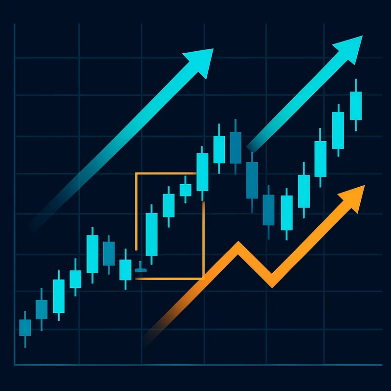
Charts serve the same function whether you trade manually or algorithmically. A discretionary trader scans a chart and decides to enter. An algorithmic trading system scans the same chart and fires an order when predefined conditions are met. The difference is consistency: a bot applies the same rules every time; a human does not.
Chart literacy matters before you build any strategy because you cannot define a rule for something you cannot describe. If you cannot articulate why a setup looks tradeable — which level, which indicator, which candle — you cannot encode it. Everything in the automation workflow starts here.
Types of Trading Charts: Line, Bar, and Candlestick
Line Charts: Simplicity at a Cost
A line chart connects closing prices across time with a single continuous line. It is the cleanest visual representation of overall trend direction and is useful for a quick read of long-term price history. The limitation is significant: it discards the open, high, and low for each period, stripping out the intrabar volatility and sentiment data that most trading decisions depend on. Line charts are useful for orientation, not for strategy-building.
Bar Charts: Full OHLC in One Bar
A bar chart (also called an OHLC chart) displays four data points per period: Open, High, Low, and Close. A vertical line marks the high-to-low range; a left tick marks the open; a right tick marks the close. Bar charts carry the same information as candlesticks and are still used in some professional and futures trading contexts, but they are harder to read quickly at scale.
Candlestick Charts: The Trader's Default
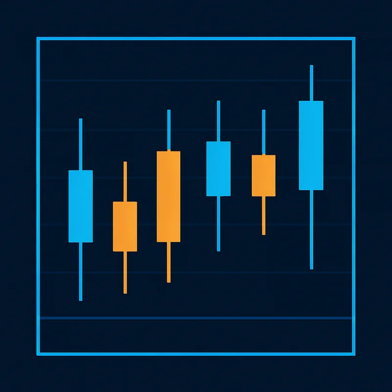
A candlestick chart presents the same OHLC data in a more visually intuitive format. Each candle has a body (the range between open and close) and wicks (also called shadows — the lines extending above and below the body to the high and low). A bullish candle (close above open) is typically rendered green or white; a bearish candle (close below open) is red or black.
Candlestick charts dominate retail and crypto trading because the body-and-wick structure communicates sentiment at a glance — who controlled the period, how decisively, and where price was rejected. All strategy-building examples in this guide use candlestick charts.
How to Read a Trading Chart
Identifying Trend Direction
Price action analysis starts with identifying the dominant direction of price movement. An uptrend is characterized by a sequence of higher highs and higher lows — each rally exceeds the previous peak, and each pullback holds above the previous trough. A downtrend shows lower highs and lower lows. When neither pattern is clear, price is in consolidation (also called a sideways or ranging market).
Candle bodies and wicks add nuance. A long wick on the upper end of a candle signals that buyers pushed price up but sellers rejected it — bearish pressure at that level. A long lower wick signals the opposite. Small bodies with long wicks in both directions indicate indecision.
Support and Resistance: Where Price Reacts
Support is a price level where buying pressure has historically been strong enough to halt or reverse a decline. Resistance is the mirror: a level where selling pressure has capped advances. These levels are not magic lines — they are zones where enough market participants have previously acted that their orders cluster.
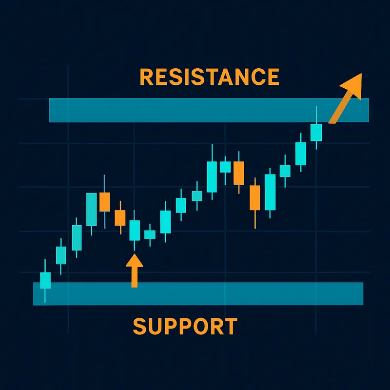
To identify them, look for price levels where the chart shows multiple touches, reversals, or consolidation. Horizontal lines drawn at these zones become reference points for entries, exits, and stop-loss placement. A level that acted as resistance often becomes support once price breaks above it — this flip is one of the most reliable structural signals in technical analysis.
Volume: Confirming What the Candles Show
Trading volume measures the number of units traded in a given period and is displayed as a histogram below the price chart. Volume is a confirmation tool: a price move accompanied by high volume is more likely to be sustained than one on thin volume. A breakout above resistance on low volume is a common false signal; the same breakout on a volume spike carries significantly more weight. Always check volume before acting on a price move.
Practical example: On a 4H BTC/USDT candlestick chart, price approaches a resistance level it has tested twice before. A large bullish candle closes above that level with a body covering most of the candle range and volume two to three times the 20-period average. That combination — structural breakout, decisive candle body, volume confirmation — is the kind of condition worth encoding into a rule.
Key Technical Indicators Used on Charts
Moving Averages: The Most Common Chart Overlay
Moving averages smooth price data over a defined period to reveal trend direction. A Simple Moving Average (SMA) weights all periods equally; an Exponential Moving Average (EMA) weights recent prices more heavily, making it more responsive to current price action.
The most actionable signal from moving averages is the MA crossover: when a shorter-period MA (e.g., 20 EMA) crosses above a longer-period MA (e.g., 50 EMA), it signals potential bullish momentum — and vice versa for a bearish cross. In rule syntax, this maps directly to: "When 20 EMA crosses above 50 EMA on the 4H chart, open a long position."
Momentum Indicators: RSI and MACD
RSI (Relative Strength Index) measures the speed and magnitude of recent price changes on a scale of 0–100. Readings above 70 are conventionally considered overbought (potential reversal or pullback); readings below 30 are oversold (potential bounce). As a rule condition: "RSI < 30" is a discrete, testable threshold.
MACD (Moving Average Convergence Divergence) tracks the relationship between two EMAs (typically 12 and 26 periods) and plots the difference as a line alongside a signal line (a 9-period EMA of the MACD line). When the MACD line crosses above the signal line, it indicates building bullish momentum. Like the MA crossover, this is a clean binary event — it either happened or it did not — which makes it straightforward to encode.
Volatility and Volume Indicators
Bollinger Bands consist of a middle SMA with two bands plotted at a standard deviation above and below it. When bands contract (a "squeeze"), volatility is low and a breakout is often imminent. When price touches the upper or lower band, it signals the asset is trading at an extreme relative to recent volatility. This gives you a volatility-context condition: "Price touches lower Bollinger Band AND RSI < 35."
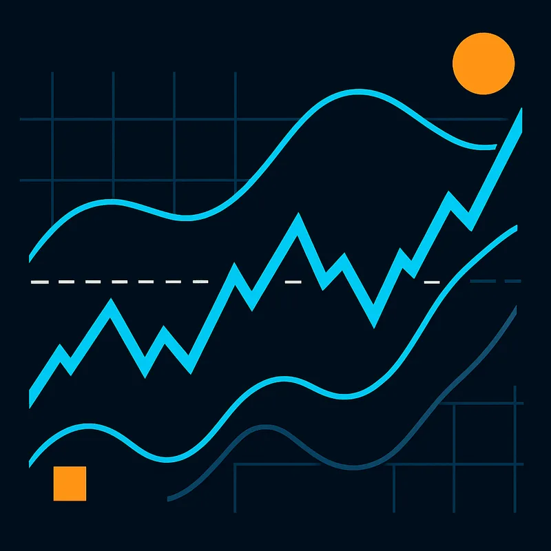
Volume indicators like OBV (On-Balance Volume) accumulate volume directionally — adding volume on up days, subtracting on down days — to show whether volume is flowing into or out of an asset. Combined with price action, OBV divergence is a useful confirmation signal.
Quberas's condition builder supports price, indicator, volume, and crossover conditions natively, so each of the above maps directly to a selectable rule type without any code.
Common Chart Patterns and What They Signal
Reversal Patterns: Spotting Trend Changes
A head and shoulders pattern forms at the top of an uptrend: three peaks where the middle peak (the "head") is higher than the two flanking peaks (the "shoulders"). A break below the neckline — the support connecting the two troughs between the peaks — signals a trend reversal. The double top is a simpler version: two peaks at roughly the same level, with a break below the intervening trough confirming the reversal. Both patterns have mirror equivalents at the bottom of downtrends (inverse head and shoulders, double bottom).
Continuation Patterns: Trading With the Trend
Flags are tight, counter-trend consolidations following a sharp move — a brief pause before the trend resumes. Pennants are similar but consolidate in a symmetrical triangle shape. Triangles (ascending, descending, symmetrical) represent a compression of price range that typically resolves in a breakout. In all cases, volume confirmation on the breakout is the critical filter.
Candlestick Patterns: Single and Multi-Bar Signals
An engulfing candle is a two-bar pattern where the second candle's body completely engulfs the first — a bullish engulfing at a support level signals a potential reversal. A doji (open and close at nearly the same price) signals indecision. A hammer (small body, long lower wick) at a support level signals rejection of lower prices.
The problem with watching for these patterns manually is inconsistency. You miss setups when you are away from the screen. You act on marginal patterns when you are watching too closely. If you can describe a pattern's conditions — "second candle body engulfs first candle body, both candles at or below support level, volume above 20-period average" — you can automate the entry and remove the inconsistency entirely.
Chart Timeframes and When to Use Each
Short-Term Timeframes: High Noise, Fast Signals
The 1-minute (1m) and 5-minute (5m) charts are the domain of scalpers — traders targeting small, rapid moves. Signal frequency is high, but so is noise: random price fluctuations that look like setups but are not. Indicators on short timeframes generate many false signals, and execution speed requirements are demanding.
The 15-minute (15m) chart sits between scalping and intraday swing trading — still fast, but with slightly cleaner structure.
Medium and Long-Term Timeframes: Cleaner Trends
The 1-hour (1H) and 4-hour (4H) charts are the most widely used for crypto swing trading. The 4H timeframe in particular offers a balance of signal frequency and signal quality: trends are visible, support and resistance levels are meaningful, and indicator readings are less noisy. The daily (1D) chart is the standard reference for position traders and for identifying the dominant macro trend.
Multi-Timeframe Analysis: Aligning Signals Across Scales
Multi-timeframe analysis means checking the same asset across two or more timeframes before acting. A common approach: use the 1D chart to identify the dominant trend direction, then drop to the 4H chart to time the entry. A long entry on the 4H chart that aligns with an uptrend on the 1D chart carries more conviction than one that trades against the higher timeframe trend.
Timeframe is not just a display setting — it is a strategy parameter. The same MA crossover on a 15m chart and a 4H chart are different signals with different risk profiles. Quberas allows timeframe to be defined per condition in the strategy builder, so you can specify that one condition must be true on the 4H chart while another is evaluated on the 1H.
From Chart Reading to Automated Strategy: Turning What You See Into Rules
Translating a Chart Signal Into a Condition
The gap between "I see a signal" and "my bot acts on it every time" is a translation problem. A chart signal is a visual observation; a strategy rule is a precise logical statement. The translation requires you to specify: which indicator or price level, which threshold or event, which timeframe, and what action follows.
Every condition you can describe in plain language — "when X crosses Y," "when price is above Z," "when RSI drops below 30" — maps to a rule in a no-code strategy builder. The visual condition builder in Quberas uses a puzzle-style interface where you select the condition type (price, indicator, crossover, volume), set the parameters, and connect conditions with AND/OR logic. No syntax errors, no missing brackets.
Building a Simple MA Crossover Bot: A Worked Example
Here is a concrete example using the MA crossover signal on a 4H BTC/USDT chart:
- Entry condition: 20 EMA crosses above 50 EMA on the 4H chart AND RSI is below 60 (avoiding entries into already-overbought conditions).
- Volume filter: Volume on the crossover candle is above the 20-period average volume.
- Stop-loss: Placed below the most recent swing low identified on the 4H chart.
- Exit condition: 20 EMA crosses back below 50 EMA, OR price hits a defined take-profit target.
In Quberas's deal map interface, each of these becomes a visual block: entry conditions, optional averaging orders (to scale in if price dips after entry), exit rules, and stop-loss — the four pillars of a complete strategy. You can see exactly where each rule would have triggered directly on the chart, which makes it immediately obvious whether the logic does what you intended.
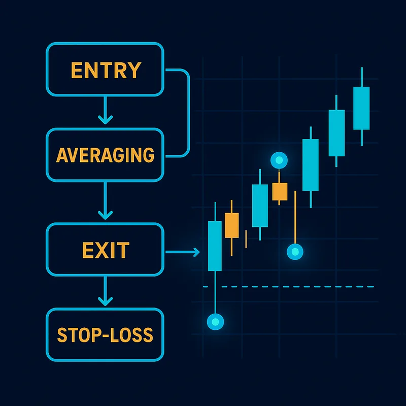
Nested logic is where the real power lies. Instead of a single condition, you combine: RSI < 30 AND price above 200 EMA AND volume spike above 1.5× average. This filters out weak signals and keeps only high-conviction setups. The condition builder handles this with nested AND/OR blocks — no code required.
Backtesting Your Chart-Based Rules Before Going Live
Once your conditions are defined, the next step is backtesting — running your strategy rules against historical price data to see how they would have performed. Backtesting answers the question: does this pattern actually produce an edge, or does it just look good on the handful of examples I remember?
A backtest surfaces problems that are invisible when you are manually scanning charts: rules that trigger too frequently on noise, stop-losses that are too tight for the timeframe's natural volatility, or entry conditions that work in trending markets but fail in ranging ones. Fixing these issues on historical data costs nothing; discovering them live costs real capital.
After backtesting, the path to a live automated bot is a direct continuation of the same workflow — no context switch, no separate coding environment, no re-entering parameters.
Chart reading is the foundation. Automation is what makes it scale. If you can describe a setup in logical terms — which is exactly what this guide has shown you how to do — you have everything you need to build a bot that executes it consistently.
Ready to stop watching charts manually? Try Quberas's visual strategy builder to turn your chart conditions into a live automated bot — no code required. Explore the demo and see your rules trigger directly on the chart.